


Golden tip: Learn how to build a responsive navbar
There are several creative and technical ways to handle responsiveness (e.g., Flexbox, Media Queries, CSS Grid)... A clear example is the responsive navbar.


Today it's practically impossible to have a website that isn't responsive.
There are several creative and technical ways to handle responsiveness (e.g., Flexbox, Media Queries, CSS Grid, etc.) in many different contexts, but there are some adaptations that are practically standard across all projects.
A clear example is the responsive navbar. When it has many items, it inevitably becomes unsuitable for the mobile environment, since the items literally don't fit in the available space.
In these situations, we need to think of creative techniques. Today we're going to learn how to build a minimalist and elegant responsive navbar using just basic HTML, CSS, and a tiny little bit of JavaScript.
To learn how to do this, we'll use as an example the solution I applied on my own personal website. I'm biased, but I think it served its purpose well 😄
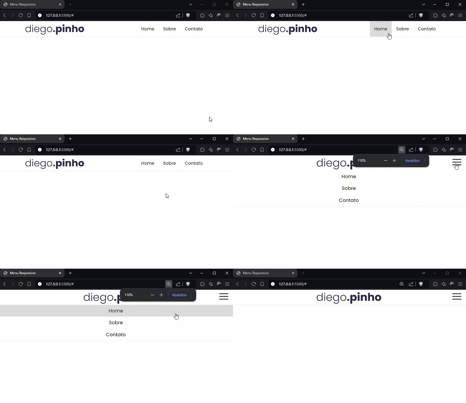
Let's start by creating the site's basic structure for desktop. In this case, we essentially need three HTML elements: a <nav> tag for the navigation bar, an <img> tag for the logo, and <ul> and <li> tags for the list of links:
<!DOCTYPE html>
<html lang="pt-br">

<head>
  <meta charset="UTF-8">
  <meta name="viewport" content="width=device-width, initial-scale=1.0">
  <title>Menu Responsivo</title>
  <link rel="stylesheet" href="style.css">
</head>

<body>
  <nav class="navbar">
    <img src="logo.png" alt="logo">
    <div class="navbar-links">
      <ul>
        <li><a href="#">Home</a></li>
        <li><a href="#">Sobre</a></li>
        <li><a href="#">Contato</a></li>
      </ul>
    </div>
  </nav>
</body>

</html>
Let's apply the basic CSS so it works well on desktop:
@import url('https://fonts.googleapis.com/css2?family=Poppins:ital,wght@0,100;0,200;0,300;0,400;0,500;0,600;0,700;0,800;0,900;1,100;1,200;1,300;1,400;1,500;1,600;1,700;1,800;1,900&display=swap');

* {
  box-sizing: border-box;
}

body {
  font-family: "Poppins", sans-serif;
  margin: 0;
  padding: 0;
}

.navbar {
  display: flex;
  position: relative;
  justify-content: space-around;
  align-items: center;
  border-bottom-color: rgb(234, 236, 243);
  border-bottom-style: solid;
  border-bottom-width: 1px;
}

.navbar img {
  width: 220px;
}

.navbar-links {
  height: 100%;
}

.navbar-links ul {
  display: flex;
  margin: 0;
  padding: 0;
}

.navbar-links li {
  list-style: none;
}

.navbar-links li a {
  display: block;
  text-decoration: none;
  padding: 1rem;
  color: #333;
  font-weight: 500;
}

.navbar-links li:hover {
  background-color: #DBDBDB;
}- Here comes our first problem: as the screen gets smaller, our navbar starts overflowing horizontally. This behavior isn't desirable. So, we need to implement the “hamburger” menu.
- The first step for this is to add to the HTML the button that will correspond to the menu and the options it will offer. There are different ways to create this button; for now, we'll build it “by hand”:
<!DOCTYPE html>
<html lang="pt-br">

<head>
  <meta charset="UTF-8">
  <meta name="viewport" content="width=device-width, initial-scale=1.0">
  <title>Menu Responsivo</title>
  <link rel="stylesheet" href="style.css">
</head>

<body>
  <nav class="navbar">
    <img src="logo.png" alt="logo">
    <a href="#" class="toggle-button">
      <span class="bar"></span>
      <span class="bar"></span>
      <span class="bar"></span>
    </a>
    <div class="navbar-links">
      <ul>
        <li><a href="#">Home</a></li>
        <li><a href="#">Sobre</a></li>
        <li><a href="#">Contato</a></li>
      </ul>
    </div>
  </nav>

  <script src="script.js"></script>
</body>

</html>
Now let's add the CSS that will build it properly on the screen:
.toggle-button {
  position: absolute;
  top: .75rem;
  right: 1rem;
  display: none;
  flex-direction: column;
  justify-content: space-between;
  width: 30px;
  height: 21px;
}

.toggle-button .bar {
  height: 3px;
  width: 100%;
  background-color: #333;
  border-radius: 10px;
}- Now we have to adjust it so it only appears when the device has a small screen. For that, we'll need Media Queries.
- Media queries work like conditionals within our CSS code. This way, we can work with conditions for an element to appear or not. Let's see how our example turns out:
@media (max-width: 800px) {
  .navbar {
    flex-direction: column;
    align-items: center;
  }

  .toggle-button {
    display: flex;
  }

  .navbar-links {
    display: none;
    width: 100%;
  }

  .navbar-links ul {
    width: 100%;
    flex-direction: column;
  }

  .navbar-links ul li {
    text-align: center;
  }

  .navbar-links ul li a {
    padding: .5rem 1rem;
  }

}
Now we have one more problem to solve. When clicking the menu, we want the items to appear, and when clicking again, we want them to disappear. This is where we'll need the help of JavaScript!
const toggleButton = document.getElementsByClassName("toggle-button")[0];
const navbarLinks = document.getElementsByClassName("navbar-links")[0];

toggleButton.addEventListener("click", () => {
  navbarLinks.classList.toggle("active");
});

.navbar-links.active {
  display: flex;
}
And that's it! We have our beautiful responsive navbar! Just adapt the texts, options, sizes, and so on to better fit your project! 😀
—
Repository
https://github.com/Professor-DiegoPinho/menu-responsivo
Acknowledgments
Did you like this content? Then like and share it! 👏
Translated from the Brazilian Portuguese original · Read the original