

Accessible combobox from scratch: implementing the WAI-ARIA pattern by hand
A combobox with autocomplete in plain HTML and JS, following the APG step by step, with keyboard support, aria-activedescendant, and real screen reader testing.

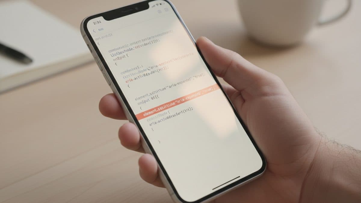
A combobox with autocomplete in plain HTML and JS, following the APG step by step, with keyboard support, aria-activedescendant, and real screen reader testing.
The problem isn't a pretty autocomplete. The problem is the screen reader user who types two letters, hears nothing, presses the down arrow, and NVDA announces "blank". This happens every day in Brazilian products that pulled a <Combobox> from a UI lib without understanding the ARIA contract behind it. When the component breaks in an update or you need to customize it, nobody knows how to fix it because nobody knows what was supposed to be happening.
The best cure for that is to build one by hand at least once, following the Combobox Pattern from the WAI-ARIA Authoring Practices Guide. I'll build here the most common case: editable combobox with list autocomplete and manual selection (what the APG calls aria-autocomplete="list" with manual selection). The user types, the list filters, and they either pick an option or keep what they typed.
The contract the APG defines
Before any code, here are the three states that need to be correct, or nothing works in the screen reader:
| Attribute | Where it lives | What it's for |
|---|---|---|
role="combobox" | on the <input> | tells the AT that this field has an associated popup |
aria-expanded | on the <input> | true/false depending on whether the list is visible |
aria-controls | on the <input> | points to the listbox's id |
aria-activedescendant | on the <input> | points to the id of the active option within the list |
role="listbox" | on the options container | groups the options |
role="option" + aria-selected | on each option | marks the option under virtual focus |
The detail most people get wrong: DOM focus never leaves the input. Navigating with the arrow keys inside the list is done by moving aria-activedescendant, not by calling focus() on the options. This is the virtual focus pattern the APG calls "managing focus using aria-activedescendant". The options are not part of the Tab order and do not receive tabindex.
Step 1: the HTML structure
<label id="cb-label" for="cb-input">Cidade</label>
<div class="combo">
  <input
    id="cb-input"
    role="combobox"
    type="text"
    aria-autocomplete="list"
    aria-expanded="false"
    aria-controls="cb-listbox"
    aria-labelledby="cb-label"
    autocomplete="off" />
  <ul id="cb-listbox" role="listbox" aria-labelledby="cb-label" hidden></ul>
</div>
One accessibility point that already fits here: autocomplete="off" on the input prevents the browser's native autofill from clashing with our list, overlapping two UIs. And aria-labelledby on both the input and the listbox ensures both inherit the name "Cidade" (WCAG 4.1.2, accessible name is part of the definition of done).
Step 2: rendering and filtering the options
const DADOS = ['Belo Horizonte', 'Belém', 'Brasília', 'Curitiba',
               'Fortaleza', 'Recife', 'Salvador', 'São Paulo'];

const input = document.getElementById('cb-input');
const listbox = document.getElementById('cb-listbox');
let ativo = -1; // index of the active option; -1 = none

function filtrar(texto) {
  const q = texto.trim().toLowerCase();
  return q === '' ? DADOS
    : DADOS.filter(d => d.toLowerCase().includes(q));
}

function render(opcoes) {
  listbox.innerHTML = '';
  opcoes.forEach((valor, i) => {
    const li = document.createElement('li');
    li.id = `cb-opt-${i}`;
    li.role = 'option';
    li.textContent = valor;
    li.setAttribute('aria-selected', 'false');
    li.addEventListener('click', () => selecionar(i));
    listbox.appendChild(li);
  });
}
Note that each <li> gets a predictable id (cb-opt-0, cb-opt-1...). That id is what we'll plug into aria-activedescendant. Without an id, virtual focus doesn't exist.
Step 3: opening, closing, and moving virtual focus
function abrir() {
  if (listbox.children.length === 0) return;
  listbox.hidden = false;
  input.setAttribute('aria-expanded', 'true');
}

function fechar() {
  listbox.hidden = true;
  input.setAttribute('aria-expanded', 'false');
  input.removeAttribute('aria-activedescendant');
  ativo = -1;
}

function moverAtivo(indice) {
  const opcoes = [...listbox.children];
  if (ativo > -1) opcoes[ativo].setAttribute('aria-selected', 'false');
  ativo = indice;
  if (ativo > -1) {
    const li = opcoes[ativo];
    li.setAttribute('aria-selected', 'true');
    input.setAttribute('aria-activedescendant', li.id);
    li.scrollIntoView({ block: 'nearest' });
  } else {
    input.removeAttribute('aria-activedescendant');
  }
}
scrollIntoView({ block: 'nearest' }) fixes a classic bug: since DOM focus never moves, the list doesn't scroll on its own when you go past the visible area. Without this line, the keyboard user (not just the screen reader user) loses sight of the active option.
Step 4: the keyboard, exactly as the APG requires
input.addEventListener('input', () => {
  render(filtrar(input.value));
  if (input.value && listbox.children.length) abrir();
  else fechar();
});

input.addEventListener('keydown', (e) => {
  const total = listbox.children.length;
  switch (e.key) {
    case 'ArrowDown':
      e.preventDefault();
      if (listbox.hidden) { render(filtrar(input.value)); abrir(); }
      moverAtivo(ativo + 1 >= total ? 0 : ativo + 1);
      break;
    case 'ArrowUp':
      e.preventDefault();
      if (listbox.hidden) { render(filtrar(input.value)); abrir(); }
      moverAtivo(ativo <= 0 ? total - 1 : ativo - 1);
      break;
    case 'Enter':
      if (ativo > -1) { e.preventDefault(); selecionar(ativo); }
      break;
    case 'Escape':
      fechar();
      break;
    case 'Home':
    case 'End':
      // let the browser move the text cursor: do NOT capture
      break;
  }
});

function selecionar(i) {
  input.value = listbox.children[i].textContent;
  fechar();
  input.focus();
}
Here lies the most important warning from the APG itself, in caps in the source:
IMPORTANT: Ensure JavaScript does not interfere with browser-provided text editing functions by capturing key events for the keys used to perform them.
WAI-ARIA Authoring Practices Guide, Combobox Pattern
That's why I did not call preventDefault() on Home/End: in an editable field, those keys move the text cursor, and that's browser behavior we shouldn't hijack. I only call preventDefault() on the vertical arrow keys (so the cursor doesn't move while navigating the list) and on Enter (so it doesn't submit the form).
The stumble I didn't expect: role as a property
In step 2 I wrote li.role = 'option'. That works in current browsers (the role IDL property reflects the attribute), but if you have to support something older, the silence is treacherous: the <li> shows up on screen, the click works, everything seems fine, and the screen reader simply doesn't announce "option 1 of 5". When in doubt, use li.setAttribute('role', 'option'), which is universal. It took me a while, thinking the problem was aria-activedescendant when it was actually the role that didn't even exist in the accessibility tree.
Another scare: if you forget to remove aria-activedescendant when closing the list, NVDA keeps trying to announce an option that's no longer visible. That's why fechar() calls removeAttribute.
How to verify it worked
Editor's note: the code in this section was not run in a real environment. Validate it before using it in production. Also, the suggestion to use a
role="status"region to announce the result count is the author's own recommendation, not a literal APG prescription, and the observations about NVDA and VoiceOver behavior describe the author's personal experience, not verified usage data.
Keyboard testing doesn't replace screen reader testing, but it's the first filter:
- Tab enters the input and only the input (the options don't receive focus).
- Type "be", down arrow: the first option gets highlighted and
aria-activedescendantpoints to itsid(check it in DevTools). - Escape closes the list without erasing what you typed.
- Enter on an option fills the field and closes the list.
Then, the test that really matters:
- NVDA + Firefox on Windows (NVDA is a free screen reader): as you go up/down the list, you should hear the option's text followed by "1 of 5". While typing, the number of results should be announced, which requires an extra
aria-liveregion. The APG doesn't address this point specifically; in my reading, a reasonable way to solve it is to use arole="status"region announcing something like "5 results available", but that's my own suggestion, not a recommendation from the source. - VoiceOver + Safari on macOS: confirm that the name "Cidade" is spoken when the field receives focus and that "combobox, collapsed/expanded" is announced as
aria-expandedchanges.
If the screen reader announces the field as "text edit" and never says "combobox", the role="combobox" didn't make it into the accessibility tree, go back to step 1.
What's left open
This implementation covers list autocomplete with manual selection. The APG's other variants (inline autocomplete with a highlighted completion string, automatic selection, popup as a grid or date picker) change the keyboard behavior and the semantics. And there's a part no tutorial solves for you: announcing the result count via a live region without chattering on every keystroke, which requires debounce and is where a lot of UI libs fall short. But the point of the exercise isn't to replace the lib, it's to understand the contract well enough to know exactly where to look when it breaks.
Translated from the Brazilian Portuguese original · Read the original
Figma's Dev Mode MCP Server connects approved AI agents to the design file
Figma's official documentation details the Dev Mode MCP Server, which delivers variables, components, and layout for AI agents to generate code. The promise only holds if the design system behind the file is well organized.

