
AI generates the right interface, but doesn't know which moment deserves confetti

- Reading
- 6 min
Tools like Figma's agent already assemble screens consistent with the design system. The question left for the designer is different: does this moment deserve celebration, discretion, or nothing at all?
The confetti that doesn't know what it's celebrating
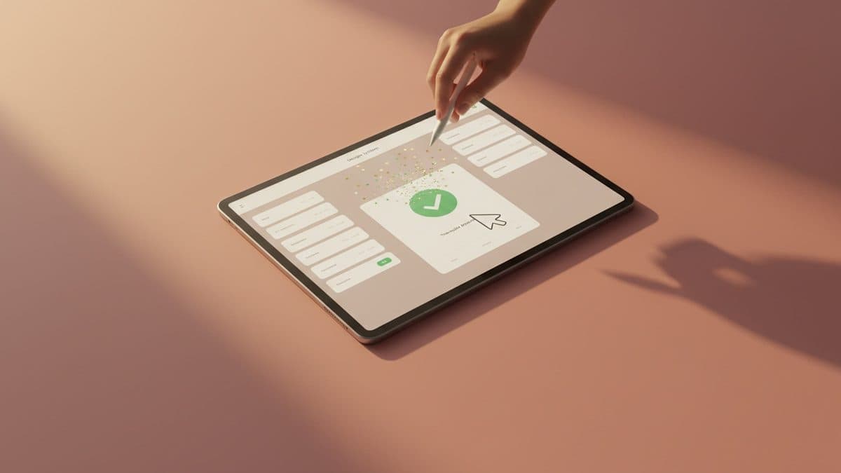
Imagine asking an AI for a success screen: checkmark, friendly copy, confetti. The components match the design system, the spacing is right, the animation is nice.
Now change the context. On one screen, someone just launched a business they'd spent months trying to get off the ground. On the other, an administrator just finished updating the forty-seventh record of the morning.
The component is identical. The experience should be different. That's the observation that opens Dolphia Arnstein's essay on UX Collective, published on November 4, 2026, and it's the starting point I want to defend here: nothing in the confetti explains which moment deserves to be celebrated. That decision depends on who did what, how often, and whether the person wants the product to make an occasion of it.
Consistency is no longer a guarantee of quality
The Figma agent's documentation explains how components, guidelines, and task context help AI generate screens that stay faithful to a team's system. That's real progress: it reduces rework and keeps every screen from reinventing decisions that were already made.
But a rendering that's faithful to the system can still be the emotionally wrong answer. A success message can be technically correct and still sound condescending. An illustration can match the brand and still take up the space the person needed to get work done.
This kind of failure doesn't show up when you inspect the component in isolation. It only exists in the relationship between the component and whoever is on that screen at that moment, which means no design system checklist will catch it on its own.
Pleasure has categories, and AI still can't tell them apart
Don Norman already split emotional design into three layers: appearance, the experience of use, and the meaning the person assigns to the object. Therese Fessenden, of the Nielsen Norman Group, goes further and distinguishes between surface delight and deep delight: a fun detail creates a moment of pleasure; a well-thought-out flow produces a quieter satisfaction that lasts the entire task.
One category doesn't invalidate the other. A product can be reliable and also have a quirky illustration simply because someone cared enough to make it pleasant, without needing to justify that with three seconds of time saved.
The problem is that "delight" became too generic a label to apply before knowing which of the three things actually happened: the color made the screen more inviting without requiring any extra step, the celebration demanded attention, the joke required cultural literacy, the transition made people wait.
Duolingo shows the illustration that was one too many
The essay's most practical example comes from Duolingo's own design team account of the redesign of the app's main tabs. When testing illustrated headers across every tab, the team ran into a concrete tension: the visual uniformity looked good, but some illustrations took up space without communicating anything relevant.
The solution wasn't to abandon expressiveness, it was to dose it: different header sizes for different purposes, with titles kept in consistent positions. That's a more useful lesson than "make every screen fun," because it shows that even an expressive brand needs to ask where the illustration actually earns its space.
That matters twice as much once that screen becomes the reference an AI is meant to reproduce. If the example screen has a large illustration, does the next one inherit that as a rule, as a possibility, or as a response to a specific situation? A tool reproduces the visible answer; the reasoning behind it doesn't travel along with it.
Tone changes, voice doesn't: the Mailchimp lesson
Mailchimp's voice and tone guide separates two things that AI prompts tend to blend together: voice, which is fixed, and tone, which responds to the reader's circumstances. The guide leaves room for humor but puts clarity first, and asks writers to consider whether the person just finished a campaign or is confused and looking for help.
That has a direct implication for how you instruct an AI. "Make it friendly and fun" doesn't resolve anything: friendly to whom, fun at what point, what just happened?
A more useful instruction describes the situation: the person's work is saved, they need to understand why the action failed, avoid humor, make the recovery path obvious. Good writing still fits within those constraints, but it's the constraints that define what the writing owes the person.
Expressive can clarify, or it can get in the way
It's worth dismantling the idea that expressive design and usable design always sit on opposite sides. Google's research on Material 3 Expressive tested an email interface where the send button was made larger, moved closer to the keyboard, and given more visual emphasis: participants found it faster. The gain didn't come from decoration, it came from the change in hierarchy.
The same report brings the counterpoint: a playback list swapped familiar rows for a scattered arrangement of album covers. Participants found it visually exciting, and usability got worse.
Both findings belong to designs tested by Google itself, not to some universal rule of style. Together, they show that the right question is never "is this expressive?", it's "what stays legible once expressiveness enters the picture?"
When the same detail turns into noise
In 2016, Asana introduced animated characters that appear after completing a task, with the option to turn them off in settings. Two years later, a discussion in the community forum shows a customer asking to turn off unicorns and monsters because they found them intrusive.
That single post doesn't prove most people hate the celebration. It proves something more uncomfortable: the same detail can be welcome to one person and unwanted to another, and giving people control over that is part of designing the experience, not an accessibility add-on.
For motion, the bar is even more objective: the AAA-level WCAG success criterion on animation from interactions exists because non-essential motion can cause real vestibular symptoms in part of the audience. Every expressive experience needs a reduced-motion version that preserves feedback and hierarchy.
The counterargument: this is over-engineering for a checkmark
The obvious objection is that not every team has the research budget to test the tone of a confirmation toast across three different scenarios. That's true, and it would be dishonest to pretend every team has Google's research maturity or Asana's scale to justify that level of care.
But the alternative isn't to ignore the problem, it's to reduce its scope. Not every moment calls for qualitative research; it calls for a simple question before approving the generative component: is this a repeated action or a milestone? Is the person in a hurry or exploring? Documenting that answer alongside the component already prevents much of the error, even without a usability lab.
What I'd document before releasing it into the design system
The original essay's most concrete proposal is a working rule, not a universal one: fuller recognition for the first significant achievement; brief feedback for repeated, routine actions; direct, restrained language for sensitive outcomes. It won't suit every product as it stands, but it gives you something concrete to question.
In practice, that means the documentation for an expressive component needs to record three things beyond the visuals: the circumstance it serves, when to dial back the intensity, and a case where it shouldn't be used at all. Without that, both a junior designer and an AI will apply the pattern wherever it's easiest to copy, not where it actually makes sense.
What sets a product designer apart is no longer drawing the button, AI already does that well enough. It's deciding, case by case, whether that moment calls for celebration, discretion, or simply for the product to get out of the way.
Translated from the Brazilian Portuguese original · Read the original
Dev Mode MCP Server lets VS Code and Cursor read the Figma file directly, without manual handoff
Figma's Dev Mode MCP Server exposes design tokens, components, and specs directly in the code editor via the MCP protocol. The gain is real, but human curation remains part of the workflow.