

How to audit the new WCAG 2.2 criteria in your design system
A step-by-step guide for Brazilian teams to test modal, carousel, and multi-step form components against Focus Not Obscured, Dragging Movements, and Redundant Entry, using axe-core and keyboard testing.

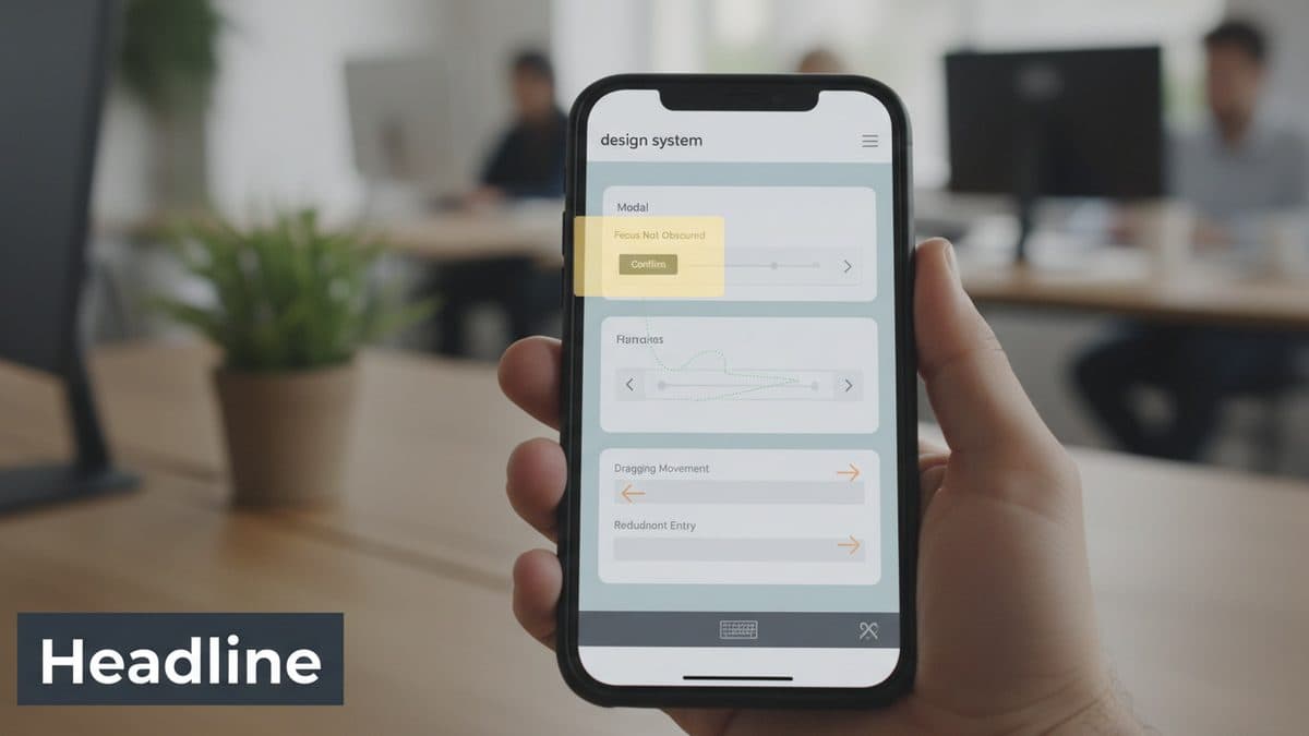
WCAG 2.2 became a W3C Recommendation on December 12, 2024. It's additive relative to 2.1: anyone who already conformed with 2.1 continues to conform, but now there are nine new criteria to cover (and one, 4.1.1 Parsing, was removed). In this tutorial I focus on three that hit directly on the most common components of any design system and that most teams still don't test: 2.4.11 Focus Not Obscured (Minimum, AA), 2.5.7 Dragging Movements (AA), and 3.3.7 Redundant Entry (A).
The central point of the angle here is: fixing an isolated page doesn't help. If the design system's modal hides focus, it hides it on all 40 screens that use it. The fix lives in the component.
Prerequisites
I ran everything with Node 20, and the versions I use in the example:
axe-core4.10@axe-core/playwright4.10 (to run on top of rendered components)@playwright/test1.48
npm i -D @axe-core/playwright @playwright/test axe-core
npx playwright install chromium
One thing I need to make clear right away: axe-core does not reliably detect the three criteria in this article. Focus Not Obscured and Dragging Movements depend on state (active focus, drag gesture) and judgment about alternatives; Redundant Entry depends on understanding the flow. axe comes in as a safety net for the rest (contrast, accessible name, roles). Finding the three new criteria comes from manual keyboard testing. Anyone who promises 100% automated WCAG 2.2 auditing is selling an illusion.
Setting up the Automated Baseline
I start by making sure the component has no obvious regressions. One test per design system component, pointing to Storybook or a sandbox page:
// a11y.spec.js
import { test, expect } from '@playwright/test';
import AxeBuilder from '@axe-core/playwright';

test('modal has no axe violations', async ({ page }) => {
  await page.goto('http://localhost:6006/iframe.html?id=modal--default');
  await page.getByRole('button', { name: 'Abrir' }).click();

  const results = await new AxeBuilder({ page })
    .withTags(['wcag2a', 'wcag2aa', 'wcag21aa', 'wcag22aa'])
    .analyze();

  expect(results.violations).toEqual([]);
});
The withTags(['wcag22aa']) already filters for the rules that axe can map to 2.2. Run it and clean up whatever shows up before moving on to the manual testing, otherwise you'll mix contrast noise with the real focus finding.
Criterion 2.4.11: Focus Not Obscured in the Modal
What the criterion requires (level AA): when an element receives keyboard focus, it cannot be completely hidden by other content created by the page (fixed bar, cookie banner, modal, sticky header).
Where it breaks in a design system: the classic case is the sticky footer or fixed header. The user tabs through a long form, the focused field slides underneath the sticky footer and disappears. Since the footer is a shared component, the bug propagates.
How to audit it manually:
- Open the component/page. Don't use the mouse.
Tabfrom the top to the end, slowly.- At each stop, ask: can I see the focus indicator in full, or at least part of it? If the element has completely disappeared behind something sticky, it's a 2.4.11 violation.
A heuristic that helps with debugging: in the console, document.activeElement.getBoundingClientRect(), and compare it with the area covered by the fixed element.
The fix goes in the component, not the page: reserve space for the fixed content with scroll-padding on the scrollable container, so that the automatic focus scroll stops before going under the sticky element.
/* in the layout component, not on a page */
.app-scroll-container {
  scroll-padding-bottom: var(--sticky-footer-height, 72px);
  scroll-padding-top: var(--sticky-header-height, 56px);
}
scroll-padding makes the browser respect the margin when bringing the focused element into the viewport. Since the value comes from a token (--sticky-footer-height), any screen that uses the footer inherits the correct behavior.
Criterion 2.5.7: Dragging Movements in the Carousel
What it requires (AA): any functionality that uses dragging needs to have an alternative that does not depend on dragging, unless dragging is essential. Button, tap, arrow, whatever it is, as long as it's single-pointer without a gesture.
Where it breaks: a carousel that only advances with swipe/drag, a price slider that only moves by dragging the thumb, a kanban that only reorders with drag-and-drop. All of these are library components, so the fix applies to every consumer.
How to audit it:
- Try to operate the component using only a simple click/tap and the keyboard. No dragging.
- In the carousel: are there "previous/next" buttons that work? Do the keyboard arrows change the slide when it's focused?
- In the slider: can you click on the track to position it, or use
ArrowLeft/ArrowRight?
If the only way to move it is by dragging, it fails.
The fix in the carousel component:
<div role="group" aria-roledescription="carrossel" aria-label="Destaques">
  <button aria-label="Slide anterior" onClick={prev}>‹</button>
  <div className="track" onKeyDown={(e) => {
    if (e.key === 'ArrowRight') next();
    if (e.key === 'ArrowLeft') prev();
  }} tabIndex={0}>
    {/* slides */}
  </div>
  <button aria-label="Próximo slide" onClick={next}>›</button>
</div>
Keep the swipe for whoever wants it, but it can never be the only path. For a native slider, <input type="range"> already solves keyboard support for free, which is a strong argument against reinventing the control with a draggable div.
Criterion 3.3.7: Redundant Entry in the Multi-Step Form
What it requires (level A, i.e., the baseline): information the user has already provided within the same process must be auto-filled or available for selection, without forcing them to re-enter it. Exceptions: when re-entering is essential (confirming a password), the previous information is no longer valid, or for security reasons.
Where it breaks: a checkout that asks for "billing address" right after "shipping address" without a "use the same" option. A signup wizard that loses data when going back a step. Since the wizard is usually an orchestration component in the design system, it can be fixed in the right place.
How to audit it:
- Go through the entire flow, noting every field requested.
- Mark any data requested twice.
- For each repetition, ask: is there autofill, or a "same as above"? Is the repetition essential (password confirmation)? If it's not essential and there's no shortcut, it's a violation.
The fix in the wizard component: persist state between steps and expose a "copy from previous step" option.
<Checkbox
  label="Endereço de cobrança igual ao de entrega"
  checked={sameAsShipping}
  onChange={(v) => {
    setSameAsShipping(v);
    if (v) copyFields('shipping', 'billing');
  }}
/>
Also use the correct autocomplete on inputs (autocomplete="postal-code", "street-address") so the browser can help. It's a cheap detail that fulfills the spirit of the criterion.
Closing the Loop: Finding, Criterion, Component
What really changed in my audit routine was that I stopped reporting "bug on screen X." Each finding turns into a line like this: slide only advances by swipe → 2.5.7 → Carousel component → add prev/next buttons + arrow-key navigation. This way the fix goes into the component's definition of done and doesn't come back.
Two points remain open and are worth following. First, tool maturity: axe-core covers 2.1 well, but the 2.2 criteria that depend on state still require human judgment, so plan for manual QA time. Second, policy: in Brazil, eMAG (Brazil's digital accessibility standard for government websites) and other digital accessibility discussions still reference earlier versions, but since WCAG 2.2 is backward-compatible, targeting it already covers 2.0 and 2.1 and gets ahead of any regulatory update. To check each criterion in detail, the canonical material is the How to Meet WCAG 2.2 and Understanding WCAG 2.2, from the W3C itself.
Translated from the Brazilian Portuguese original · Read the original

Buy or build has become a design decision, not just a product and finance one
With AI, building an internal tool has become as easy as subscribing to one. The real difference now lies in maintenance, the seams between systems, and who controls the data, and that's design work.