
Native is a floor, not a ceiling: why ignoring system components got more expensive with AI
With AI generating polished screens in seconds, appearance stopped being a differentiator. What remains as a real advantage is what only the operating system delivers: behavior, accessibility and automatic updates.


- Reading
- 6 min
- Tables
- 1
With AI generating polished screens in seconds, appearance stopped being a differentiator. What remains as a real advantage is what only the operating system delivers: behavior, accessibility and automatic updates.
For years, designing your own controls instead of using the system's was a rational trade-off: you lost automatic visual updates, but gained a brand identity no competitor could easily copy. Designer Mathieu Poli argues, in an essay published on UX Collective on November 6, that this math has changed. When any generative AI model can produce a "beautiful" screen from a prompt, appearance stops being what separates one product from another. What's left is what a screenshot doesn't show: system behavior.
The case he uses to prove the point is Liquid Glass, the visual material Apple introduced in iOS 26 in June 2025, at WWDC. In the technical UIKit session, the company's message to those using native components was direct:
Your apps get this new appearance as soon as you recompile with the new SDK.
Apple, UIKit session at WWDC 2025
The price of designing your own controls
When iOS 26 launched on September 15, 2025, tab bars, sheets, popovers, and controls in apps that used native frameworks changed overnight, without any designer touching a thing. Apps that designed their own controls, as those built with Flutter do, gained none of that.
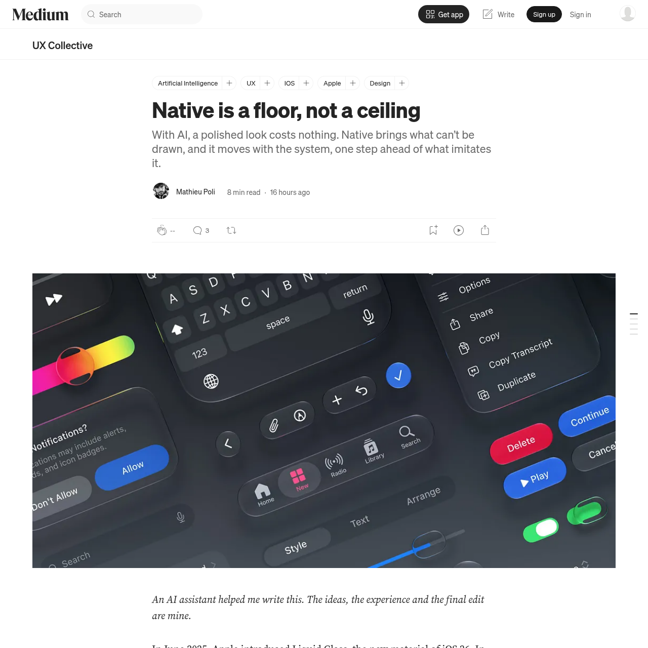
Flutter's own documentation presents this custom design as an advantage, not a flaw: a Flutter app "looks and feels the same on all versions of the operating system, even if the OS has changed the implementations of its controls."
Looks and feels the same on all versions of the OS, even if the OS changed the implementations of its controls.
Official Flutter documentation
That promised stability turned into visible delay. On GitHub, the Flutter team responded that it was not developing Apple's new look in the Cupertino library, the one that mimics iOS, for now. The team has already moved these libraries out of the framework's core to speed up the work and says Liquid Glass support is in progress, but as of November 5, 2026, the issue remains open.
What AI copies, and what it doesn't see
Poli tested several AI models, asking for app screens for a study he plans to publish. The conclusion: they imitate the system, but only what can be seen, and only under certain conditions.
Asking for "a mobile app" without specifying which system produces a generic screen. Writing "iPhone" already brings switches shaped like iOS switches. But even a year after iOS 26 launched, the iOS these models draw by default is still mostly the old one: the floating tab bar and sheets detached from the edges, hallmarks of iOS 26, only show up when the prompt explicitly asks to follow "the platform's current conventions," and even then rarely. In Poli's test with Claude Opus 5.5, asking for a daycare app with that extra detail was what made the floating bar appear.
An academic study published this year reinforces the finding. Researchers asked three AI design tools to generate 138 app screens, without mentioning iOS or Android. The models learned what the authors call the "visual syntax of contemporary mobile interfaces": navigation conventions almost always show up. But this success, according to them, is "pattern-guided, not principle-guided," and there's a significant gap between visual and functional usability: help, error prevention, and error recovery tend to be missing.
What a screenshot doesn't show
Imitating the appearance is already a lot of work. But the floor Poli talks about is mostly behavior, not image:
- The back gesture, which works the same way in any native app
- The share sheet every user recognizes by heart
- The confirmation that, in iOS 26, grows out of the very button that opened it
- The text that scales in size when the user changes the accessibility setting
- The layout that flips on its own for Arabic or Hebrew
A hand-redesigned control has to rebuild all of that, and nothing guarantees it will succeed. Kate Owens, from accessibility consultancy Deque, documented a custom SwiftUI slider that VoiceOver simply "skipped over entirely and never focused." Back in 1998, researchers John Satzinger and Lorne Olfman had already shown, with desktop software, that commands that change from one application to another make the user perform more actions, while a different visual appearance tends to make them more precise. What matters isn't the interface's face: it's the way you act within it staying constant.
Where the ceiling stays open
The floor doesn't settle the question of identity. In 2023, the Apple Design Award recognized Flighty, a flight-tracking app, in the Interaction category, precisely for fitting "perfectly into the platform." That same year, it recognized Duolingo, with a heavily stylized interface full of characters, praising its "first-rate" design. Both follow the floor of native components; Duolingo just spends a much bigger brand budget on top of it.
| App | Award (Apple Design Awards 2023) | Where identity is invested |
|---|---|---|
| Flighty | Interaction | Almost no custom layer: uses the system's own Live Activities and Dynamic Island |
| Duolingo | Delight and Fun | Illustration, characters, and tone of voice, on top of standard controls |
Former Apple icon designer Louie Mantia summed up the opposite risk, that of confusing imitation with quality, in a critique of Liquid Glass itself published in 2025:
Everyone can look decent without actually being decent.
The counterargument that deserves to be taken seriously
Flutter's promise of a stable appearance across system versions isn't irrational: for small teams, or for products living on multiple platforms at once, recompiling with every SDK change has a real cost, and not every team has the bandwidth for it. A study of nearly 12,000 Android apps, by Ivano Malavolta, shows that native and hybrid apps (web apps inside a native shell) perform the same in user ratings. In other words: the native floor doesn't guarantee a better score in the app store.
Even so, the only controlled experiment I found comparing the two approaches head to head, by Esteban Angulo and Xavier Ferré, in 2014, shows a noticeable difference on the iPhone specifically: among 14 people testing two versions of the same app, 86% chose the native version as closer to "an app for my phone," versus 7% for the cross-platform version. On Android, the difference was much smaller (52% to 39%). The lesson isn't that cross-platform is always worse: it's that, in the Apple ecosystem, the gap between imitating and being native shows up faster for the people using it.
What to do with this in your product
The practical split Poli proposes, and one I consider the most useful part of the argument: what comes from the system (navigation, back, share, confirmations, sheets, controls, text size) you don't redesign by default, because the risk of redesigning it badly is greater than the gain of looking unique. What comes from the brand (content, headline typography, illustration, tone of voice, the few moments when the app surprises) is where it's worth spending the differentiation budget.
When the mockup comes out of an AI, the question worth asking in your discovery process isn't "did it turn out pretty?" It's: what, in this generated screen, looks like a system control but actually doesn't behave like one? Naming the device and asking for "the platform's current conventions" in the prompt helps narrow the gap, but doesn't close it. The human review that's missing is precisely checking whether what looks native really is native, or just its image.
Translated from the Brazilian Portuguese original · Read the original
The 1989 search theory that explains why generative AI misses the mark
Researcher Marcia Bates described in 1989 how people actually search for information: bit by bit, changing their minds along the way. Generative AI still ignores this, and the price shows up in click metrics and abandoned AI projects.