

Google tests pink highlight in featured snippets, and the color isn't just cosmetic
The search engine is experimenting with swapping its usual blue for pink in the highlight of passages within snippets and AI Overviews. For publishers, what matters is the effect on CTR, not color preference.

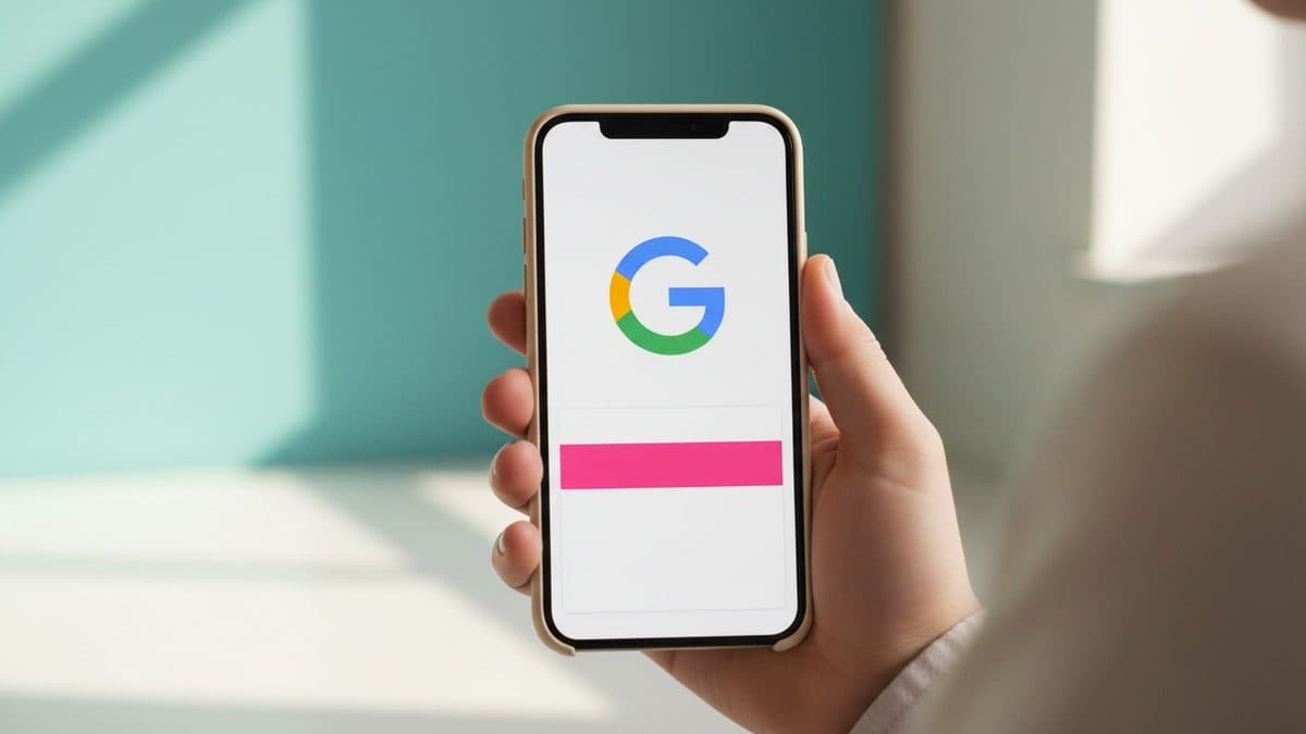
Google is testing a different color for the phrase highlight inside featured snippets and AI Overviews: instead of the usual blue, a pink highlight showed up. The finding was reported by Sachin Patel, who posted the screenshot on X and on Search Engine Watch, and covered by Search Engine Roundtable. Barry Schwartz, the author of the piece, tried to reproduce the behavior and couldn't, which suggests a limited-rollout test, a common pattern in the search engine's interface experiments.
Schwartz ends the piece with a deliberate shrug: "I'm not sure I care if it's blue, pink, brown, yellow, or any other color." The remark is honest, but for those who optimize content, it's worth looking past personal taste. A color change in a highlight element isn't just cosmetic: it affects contrast and, potentially, click behavior.
What this highlight is and why it exists
When Google builds a featured snippet, it pulls a passage from a page and, often, highlights the specific sentence that answers the user's question. This highlight works as a visual shortcut: instead of the reader scanning the whole paragraph, the eye goes straight to the marked piece. The same logic appears in AI Overviews, where the search engine highlights the passage that supports the generated answer.
Blue is the default color for this highlight, and the pink experiment is just another episode in a series. Roundtable itself notes that Google has tested other colors before. The search engine runs UI variations continuously to measure engagement, and highlight color is a cheap variable to manipulate and easy to compare.
Why the color isn't a trivial detail
The point that the source's piece doesn't dig into, but that matters to publishers, is the practical effect of the highlight on time spent on the SERP. The more effective the highlight, the faster the user gets the answer without clicking. That's the essence of position zero: appearing at the top, yes, but running the risk of resolving the reader's question right there, without them ever visiting the site.
A flashier highlight tends to reduce the CTR of the featured snippet itself, because it delivers the answer more clearly right within the results page. A more subdued highlight may force the reader to click to read the context. The choice of color, then, isn't neutral: it's a lever for how much traffic Google returns to the publisher.
There's also the layer of accessibility and contrast. Shades of pink on a white background may have lower contrast than blue on white, depending on the exact tone, which affects people with low vision or some form of color blindness. This is one of the factors that usually decides whether a UI test like this survives or gets scrapped. It's worth watching which direction Google goes.
What developers and content teams should do (and shouldn't)
The wrong reaction is trying to "optimize for pink." There's no markup, attribute, or schema that forces a highlight color: it's Google, on its own side, that chooses the highlighted passage and how to color it. No change to your HTML changes that.
What remains under your control is the quality of the passage that becomes a snippet. A few practical points still apply, regardless of color:
- Answer the question right away, in a self-contained sentence, at the start of the relevant block. That's the piece Google tends to pull and highlight.
- Use semantic structure: short paragraphs, lists with
<ul>/<ol>, and tables when the answer is comparative. List and table snippets have their own layout and compete for space differently. - Monitor before and after in Search Console. Filter by queries where you hold position 1 and compare impressions versus clicks. If impressions stay high but CTR drops after a while, it's a sign the snippet is resolving the question without generating a visit, and it may be worth rewriting the content to give a quick answer without giving everything away.
The bigger picture: position zero eroding
The pink test arrives at a moment when the very notion of position zero is being diluted by AI Overviews. More and more informational queries are being answered by AI at the top of the page, pushing organic results down and reducing clicks. The highlight, whether blue or pink, is part of that same "answer without a click" machinery.
For the Brazilian publisher, the strategic reading is clear: content that only answers a basic factual question is increasingly exposed to cannibalization by the SERP. Value migrates to what AI and the snippet can't summarize well: analysis, informed opinion, concrete examples, proprietary data, and first-hand experience. That's where the click still happens, because the user senses that a shallow answer isn't enough.
What remains open
Since Schwartz couldn't reproduce the test, there's no way to know whether pink is a serious UI experiment or something that leaked to a few users by mistake. Google rarely comments on these tests, and most of them never reach a broad rollout. The most likely outcome is that it stays blue, but the episode serves as a reminder: the SERP is a moving target, and user behavior in front of it changes with details beyond the content owner's control. The recommendation is not to chase the color, but to measure, in Search Console, what each Google tweak does to your actual CTR.
Translated from the Brazilian Portuguese original · Read the original
Search Console Doesn't Separate AI Overviews Clicks From Traditional Organic Search
Google Search Central's documentation confirms it: clicks from AI-generated Overviews are lumped together with traditional search in the performance report, with no dedicated filter. Here's how to measure GEO's effect anyway.